If you’ve looked at the “Audience” overview report in Google Analytics lately, you have probably noticed that the primary dimension is no longer “Mobile”, and the rows are no longer simply “Yes” and “No”. Indeed, up near the top of the page, you can see a note from Google:
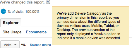
Note from Google: “We’ve changed this report. We’ve add Device Category as the primary dimension in this report, so you can see data about the different types of devices visitors uses: Mobile, Tablet, or Desktop. The previous version of this report only displayed a Yes/No option to indicate if a mobile device was detected.”
Google’s primary idea here is to push the use of Advanced Segments to analyze traffic from various devices. While that option is useful, sometimes it is clearer to simply see an uncluttered comparison of your mobile and non-mobile visitor behaviors – as in the previous version of this report page.
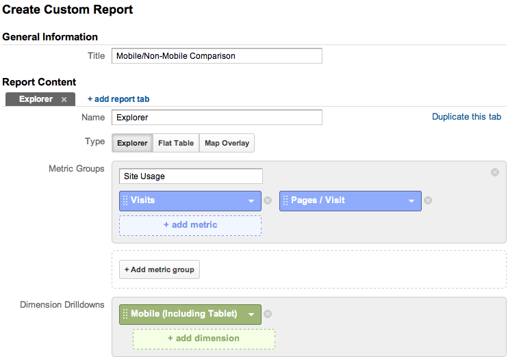
In order to emulate the old report – and, perhaps, even build upon it – we can create a basic Custom Report within Analytics. To get started, click the “Customize” button near the top of the report page:

Now, give the custom report a name, like “Mobile/Non-Mobile Comparison”. To get the essence of this report, we will remove the “Ecommerce” metric group, and set the “Site Usage” metric group to only include “Visits” and “Pages / Visit”. The key to our report is in the “Dimension Drilldowns”. Here, change the option to “Mobile (including Tablet)”
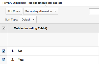
After clicking “Save”, you can now view the report, and plot those two rows, just as before:
As far as this being even more powerful than the default mobile device report from before: note that we can set all sorts of different metrics in the custom report configuration. This enables us to control the mobile and non-mobile data that we are comparing, and allows us to easily view the information relevant to us on a single page.